Burnaby FC has revealed its new logo which emphasizes unity.
"Selecting a logo which best reflects what we wanted to express as a club was something we took very seriously and we took the time and made the effort needed to get it right," executive director Morgan Quarry said in a news release.
"Thanks to collaboration among the original clubs, we feel we have landed on a logo which our Members and the Burnaby soccer community can get behind and wear with a sense of pride."
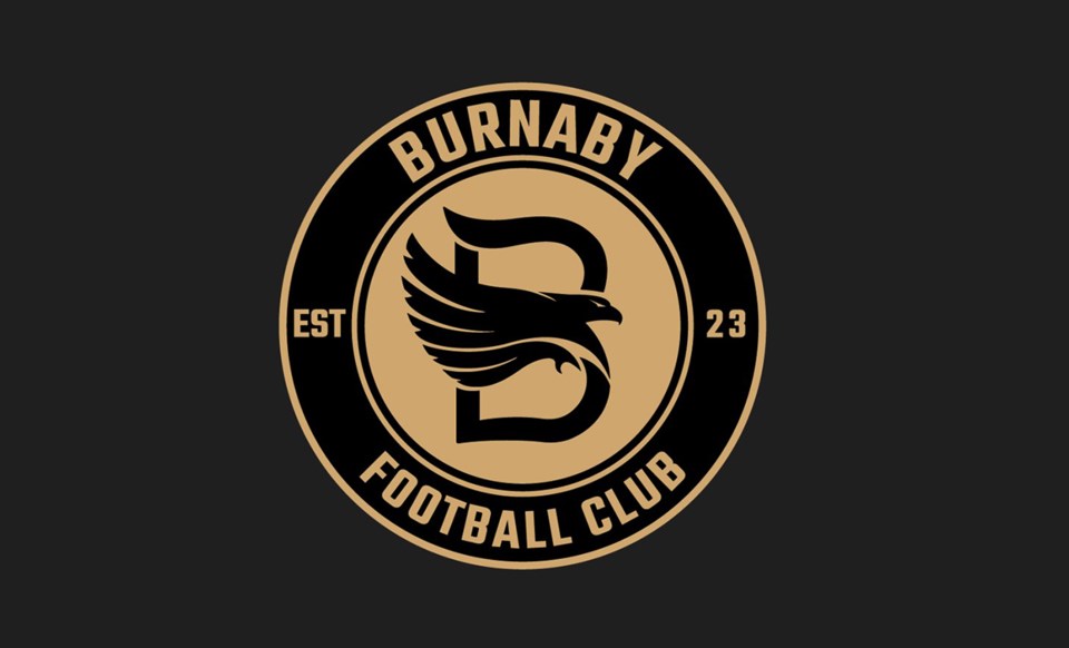
The club says the circle-shaped logo is a symbol of unity that embodies the community of Burnaby while the "B" is a direct reference to the city.
The eagle is a nod to the City of Burnaby's flag.
Its wings represent each of the five clubs that merged together — Mountain United FC, Cliff Avenue United FC, Wesburn Football Club, Burnaby Girls Soccer and Burnaby District Metro Teams.
The team colours will be gold and black, reflecting Burnaby FC's commitment and purpose statement in becoming "best in class."
![]()

