Burnaby FC is one step closer to taking the pitch.
And now, fans have a first glimpse of how the club will be showcased across all levels of competition.
Burnaby FC recently revealed its inaugural jerseys for its different divisions.
The BCSPL/metro and division one jerseys for U16 to U18 feature a black home kit with the club logo over the heart and gold Adidas striping on the shoulder.
The same design on a body of white is set to be use for away matches.
The house/divisional and adult away jerseys are the same colours on both kits, but without Adidas' three-stripe signature on the shoulders.

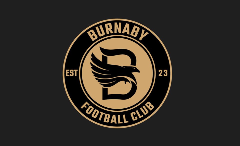
The club has described its circle-shaped logo as a symbol of the unity that embodies the community of Burnaby, while the "B" is a direct reference to the city.
The eagle is a nod to the City of Burnaby's flag, while its wings represent each of the five clubs that merged together.
That includes Mountain United FC, Cliff Avenue United FC, Wesburn Football Club, Burnaby Girls Soccer and Burnaby District Metro Teams.
"Selecting a logo which best reflects what we wanted to express as a club was something we took very seriously and we took the time and made the effort needed to get it right," executive director Morgan Quarry said in an earlier statement.
"Thanks to collaboration among the original clubs, we feel we have landed on a logo which our Members and the Burnaby soccer community can get behind and wear with a sense of pride."
For more information on Burnaby FC, you can visit the organization's website.


